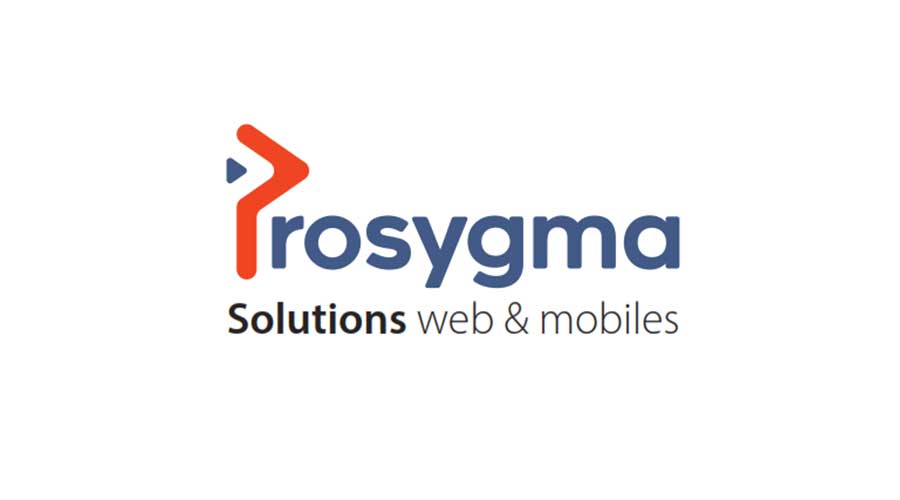
Cameroon: Prosygma Sarl presents its new visual identity
We are pleased to share with you our new visual identity which is materialized on our website and our main communication tools. It is based on the letter P, composed of a triangle that indicates the forward march in an IT ecosystem in perpetual mutation, but also the opening to the international. The P which translates Professionalism, the proximity with our customers.
Our colors: blue and orange which respectively translate the reliability and the adequacy of our solutions to the problems or requests of our customers and partners. Without forgetting the black which indicates the calm with which we work.
Our values: Proximity and reliability. These are the two values that guide our employees to provide you with a reliable and adequate solution to your needs whatever your environment and your constraints.
Our signature: Web and mobile solutions.
This change of visual identity of PROSYGMA SARL is much more than a change of logo and shapes. The three main motivations are the following:
1. The opening to the international: Well beyond Cameroon, we have already offered our services to 6 countries in Africa.
2. 10 years of existence and experience: we wanted to mark this stage of our life with new colors, shapes and ambitions.
3. Digitization of our services: for more speed, efficiency and proximity to our customers, we are committed to simplicity and ease of access to our online services by further digitizing our customer relationship.
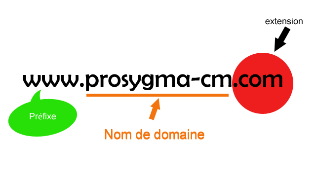
In our next article, we will inform you about the new features on our website www.prosygma-cm.com .